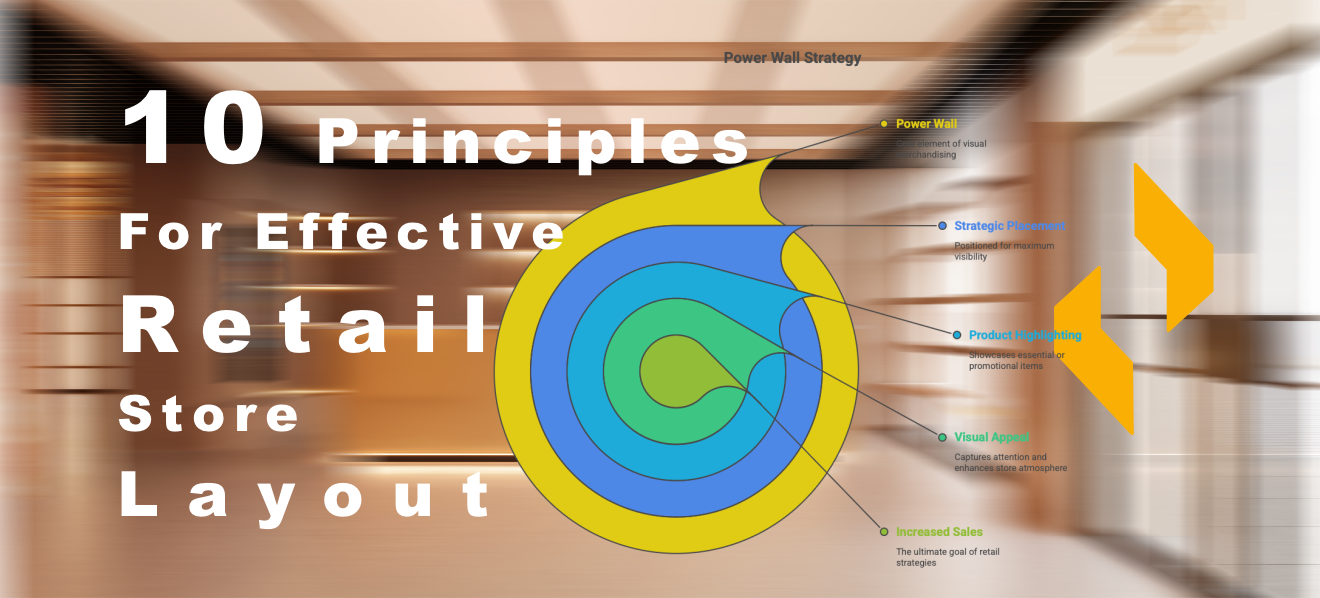
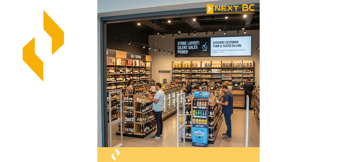
These principles serve as a straightforward guide for retailers helping them to create a store that is comfortable functional and profitable. A well-planned store layout is not just about arranging racks and counters It is about guiding customers smoothly displaying products smartly and creating a space where people genuinely enjoy shopping At Next BC we often say that a well-designed layout can serve as a silent salesman for your business. Here are 10 practical principles every retailer should remember while planning a store layout:
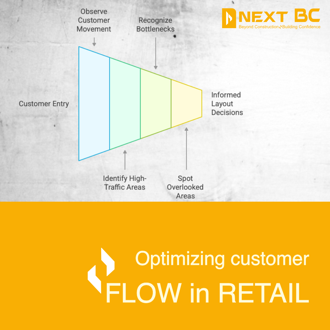
Understand Customer Flow
The first step is to watch how customers naturally move inside your store See where they walk freely where they get stuck and which corners they ignore This simple observation gives you clarity on where to place hero products and how to correct bottlenecks.
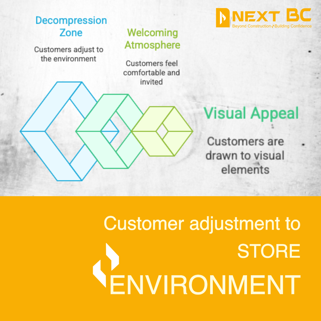
Create a Comfortable Decompression Zone
Just after the entrance, customers need a few seconds to settle into the store environment. This small area is called the decompression zone. Avoid placing important products or detailed signage here. Keep it clean open and welcoming so customers ease into the store smoothly.

Use the Right-Hand Rule
Most people turn to their right the moment they enter a store. This space is extremely valuable Use it for high-margin items new launches or attention-grabbing displays that set the tone for the entire store experience.
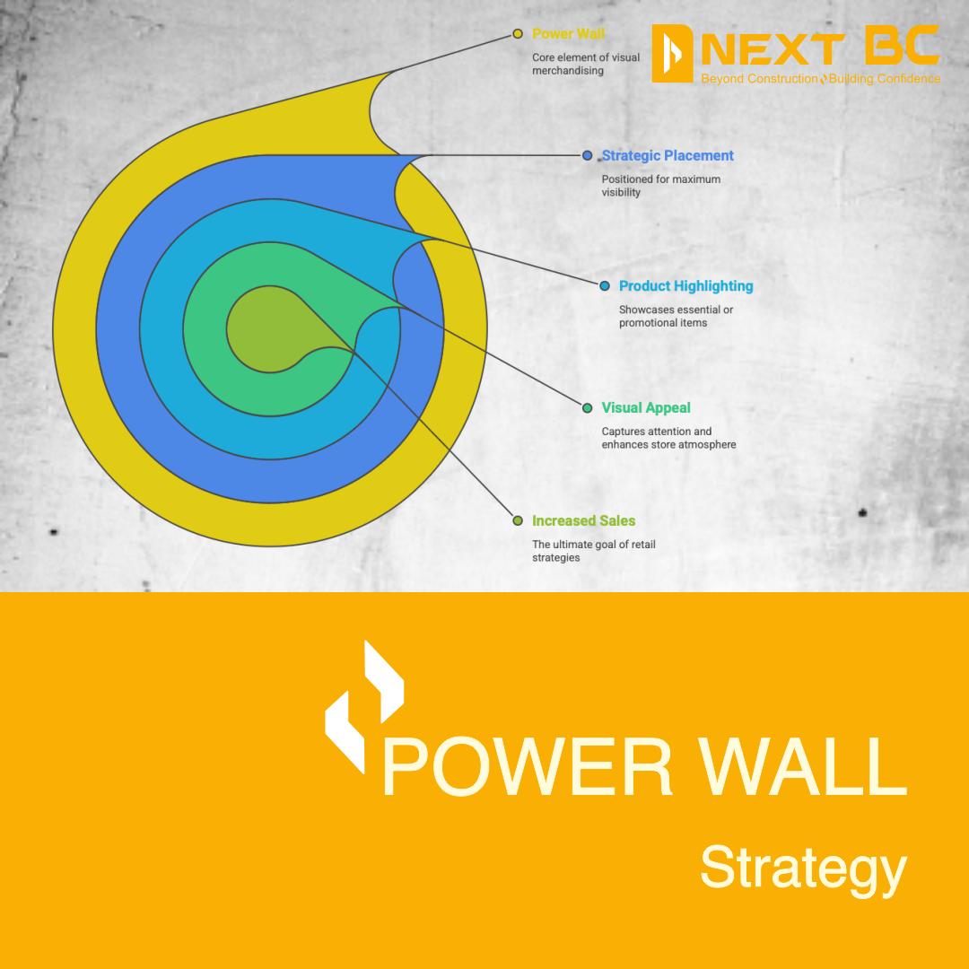
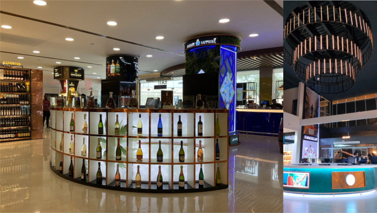
Highlight the Power Wall
The wall directly opposite the entrance is your power wall. Customers naturally look at it when they walk in. This is the perfect spot for strong visual displays, premium merchandise, or brand storytelling.
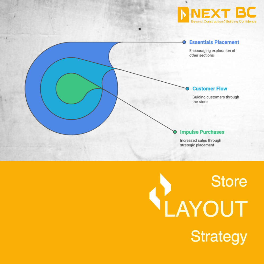
Place Essentials at the Back
Keep essential or frequently bought items at the rear side of the store Customers will walk past other sections to reach them which increases the chance of additional sales and impulse buying.
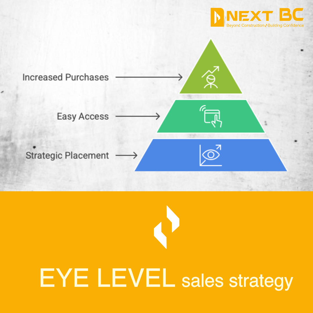
Eye-Level is Buy-Level
Simply put, keeping products at eye level improves their performance Keep your most profitable and priority items here. Low-value or bulk items can go either above or below eye level.

Use End caps Smartly
End caps (the ends of aisles) receive the highest footfall. Use them for seasonal offers, new arrivals, or combos. These displays can change the entire energy of a store if used smartly.
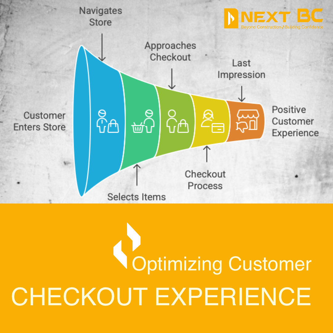
Optimize the Checkout Area
The checkout counters are not just for billing—they shape the final impression of your store. Keep them neat and smooth. Also add small impulse items like chocolates, accessories, miniature products, or trial packs near the counter to encourage last-minute purchases.
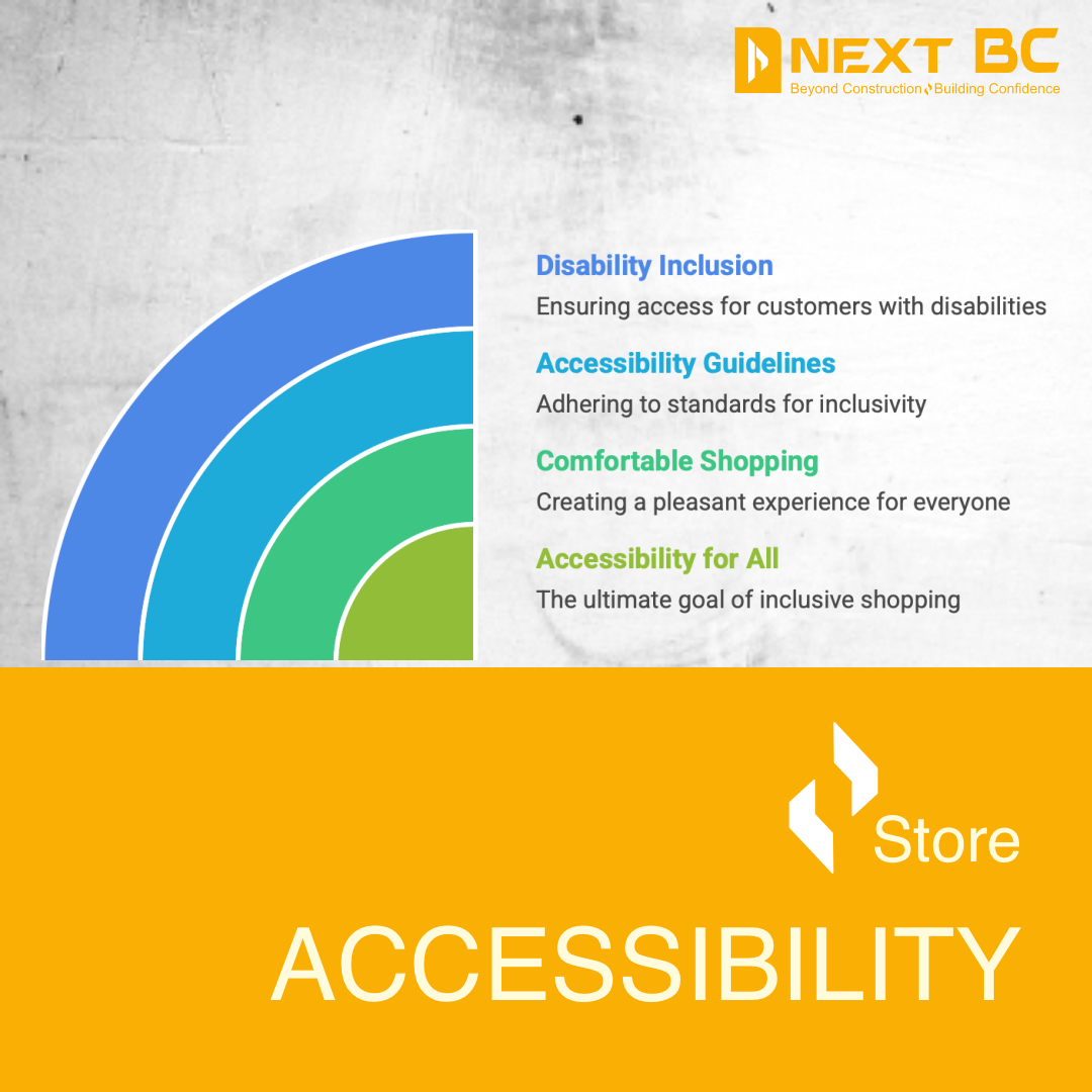
Make sure the store is easy to get to
A good store layout should work for everyone, including older people, kids, and people who have trouble getting around.To make shopping easier for everyone, keep paths clear, don't leave things lying around, and follow the rules for making things easy to get to.
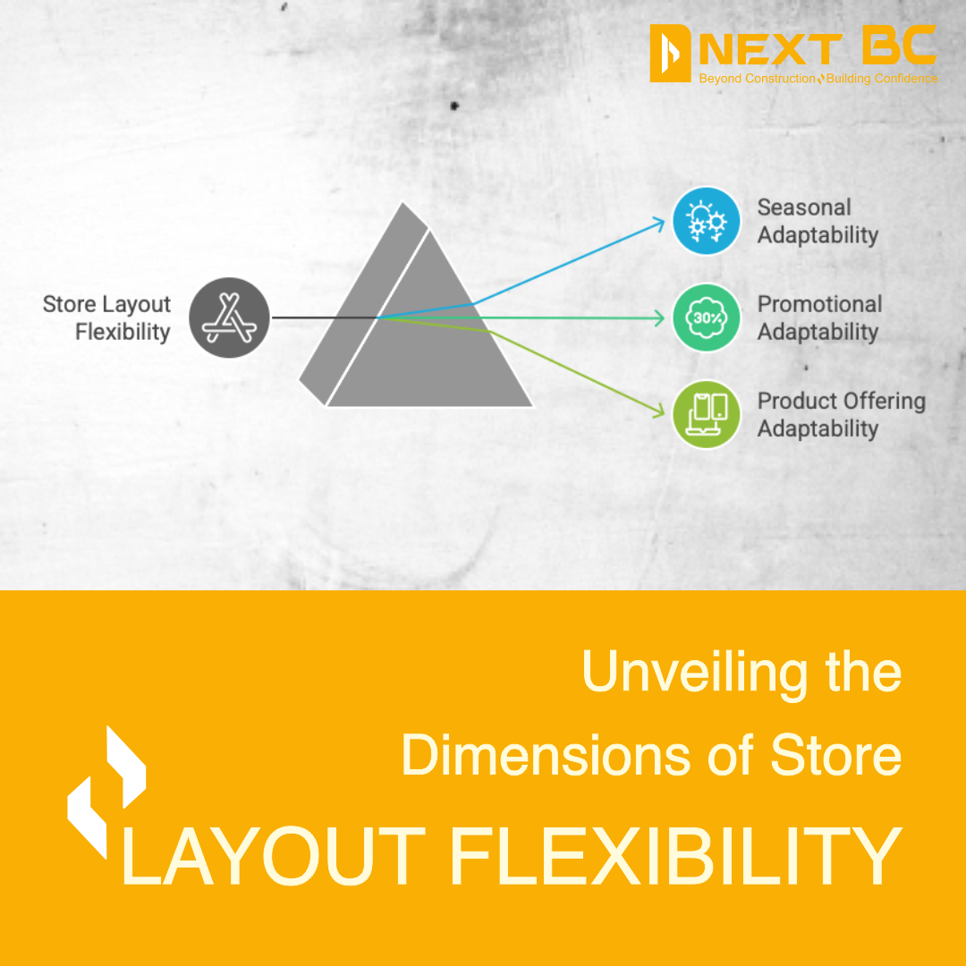
Make sure the layout can be changed.
The seasons, holidays, and trends all change what stores sell. It shouldn't be too hard to change your layout without making things too hard. Use modular racks, movable fixtures, and display systems that can be changed to keep the store looking new.
Conclusion
A thoughtful store layout doesn’t only improve sales—it builds trust comfort and a positive shopping experience When customers feel guided and relaxed inside your store they naturally explore more and buy more. If you want expert help in planning or redesigning your retail space Next BC is always ready with practical on-the-ground experience and creative solutions.
We offer design / turnkey execution with lighting, MEP and visual merchandising integration for your space. Visit www.nextbc.in to learn more . . .
Thanks
Frequently Asked
Questions
A good retail store layout guides customers smoothly improves product visibility and encourages them to explore more This directly increases dwell time impulse buying and overall sales.
Customer flow refers to how people naturally move inside a store—from entry to checkout Understanding this helps in placing products correctly and avoiding crowding or dead zones.
A decompression zone is the space just inside the entrance where customers adjust to the store environment This area should be open and clutter-free without important products or heavy signage.
Most customers instinctively turn right after entering a store This makes the right-hand side a prime area for high-margin products new launches or eye-catching displays.
The power wall is the one directly facing the entrance. Since customers notice it immediately, it is ideal for premium products, strong visuals, or brand messaging.
Putting things that people use every day or need at the back of the store makes them walk through other sections which exposes them to more products and makes them more likely to buy things on impulse.
Our Related News

Choosing Aesthetics Over Functionality: A Design Dilemma for Homeowners
When designing your dream home, it’s tempting to prioritize beautiful aesthetics—sleek countertops, statement lighting...

Ignoring Natural Lighting: A Common Oversight in Home Design
When designing a home, every decision—from color palettes to materials—contributes to the space's...
Why the Liquor Store Layout Impacts Customer Flow & Billing Speed
See how smarter aisle planning and checkout zoning reduce queues while lifting add-on sales.
How a Well-Designed Interior Increases Liquor Store Sales
Layout, adjacencies and lighting tweaks that raise basket size in specialty retail.